
Sylnovia © 2026 · All Rights Reserved
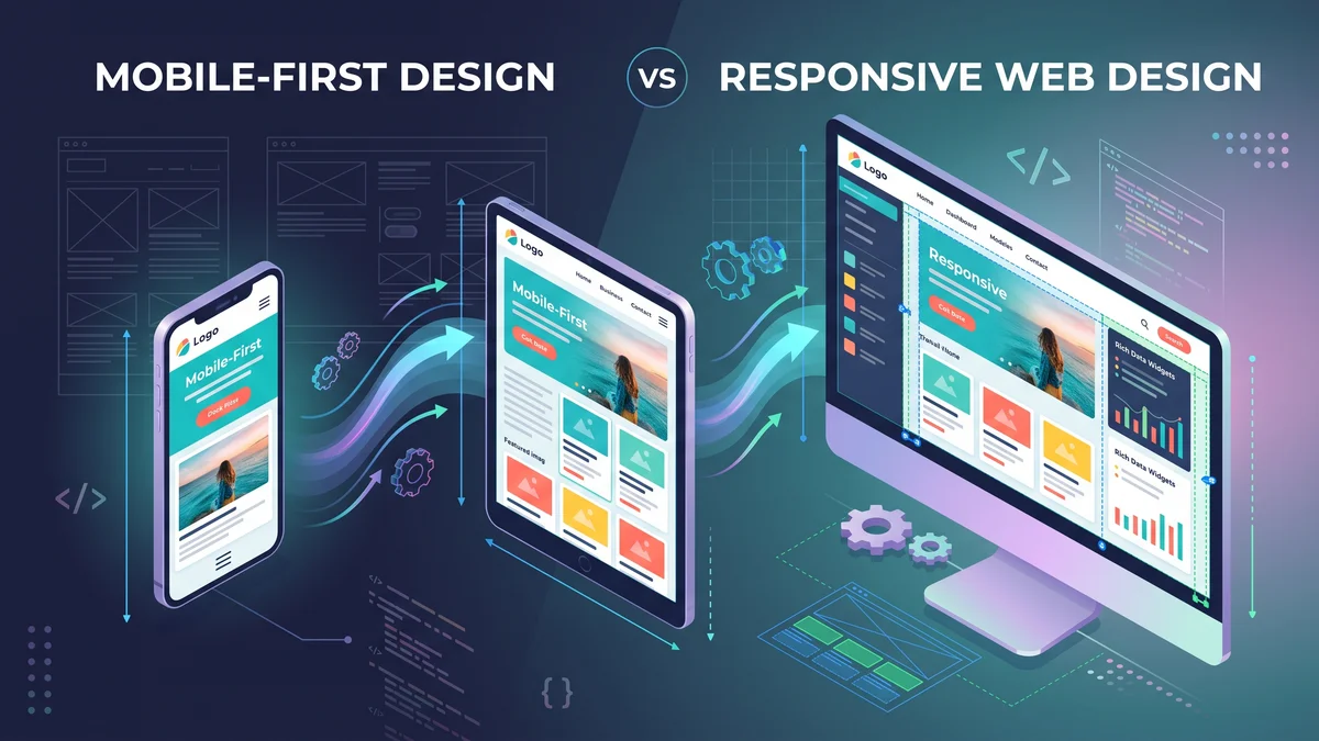
In traditional web development, teams designed elaborate 1920-pixel desktop layouts first, packing screens with multi-column sidebars, dense data tables, and hover-triggered menus. When launch approached, they attempted to "squeeze" this complex interface down to mobile screens using CSS media queries—resulting in clumsy mobile navigation, unreadable text, and sluggish mobile performance.
With mobile devices generating over 58% of global web traffic, Mobile-First Design is no longer optional—it is the foundational standard for modern digital engineering.
Designing for a 375-pixel smartphone screen forces extreme product discipline. Because visual real estate is constrained, product teams cannot hide behind clutter. You must ruthlessly prioritize what matters most: the core value proposition, the primary call to action, and the most critical user tasks.
Once the core mobile experience is fast, clean, and intuitive, you progressively enhance the interface for larger tablet and desktop screens (adding contextual sidebars, expanded analytics grids, and multi-column layouts) rather than degrading an over-engineered desktop experience.
In modern CSS frameworks like Tailwind CSS, mobile-first is enforced by default. Base utility classes apply to mobile devices, while min-width media query breakpoints progressively add complexity as screens expand:
<!-- Mobile-First: 1 column on mobile, 2 columns on tablet, 3 on desktop -->
<div class="grid grid-cols-1 md:grid-cols-2 lg:grid-cols-3 gap-6">
  ...
</div>Mobile users navigate using thumbs. High-converting mobile design adheres to ergonomic rules:
At Sylnovia, our design and development workflows are mobile-first from day one, guaranteeing blazing performance and intuitive user journeys across all screen sizes. Partner with our mobile web specialists today.
Delivering deep technical insights, architectural blueprints, and digital strategy for modern engineering squads.



The Strategic Hiring Dilemma for Growing Businesses When leadership teams decide to build a custom software platform or...
The False Dichotomy of Manual vs. Automated QA In software engineering discussions, testing is often framed as an all-o...
Why Enterprise B2B Buyers Mandate SOC 2 Type II When selling software to Fortune 500 enterprises, healthcare organizati...