
Sylnovia © 2026 · All Rights Reserved
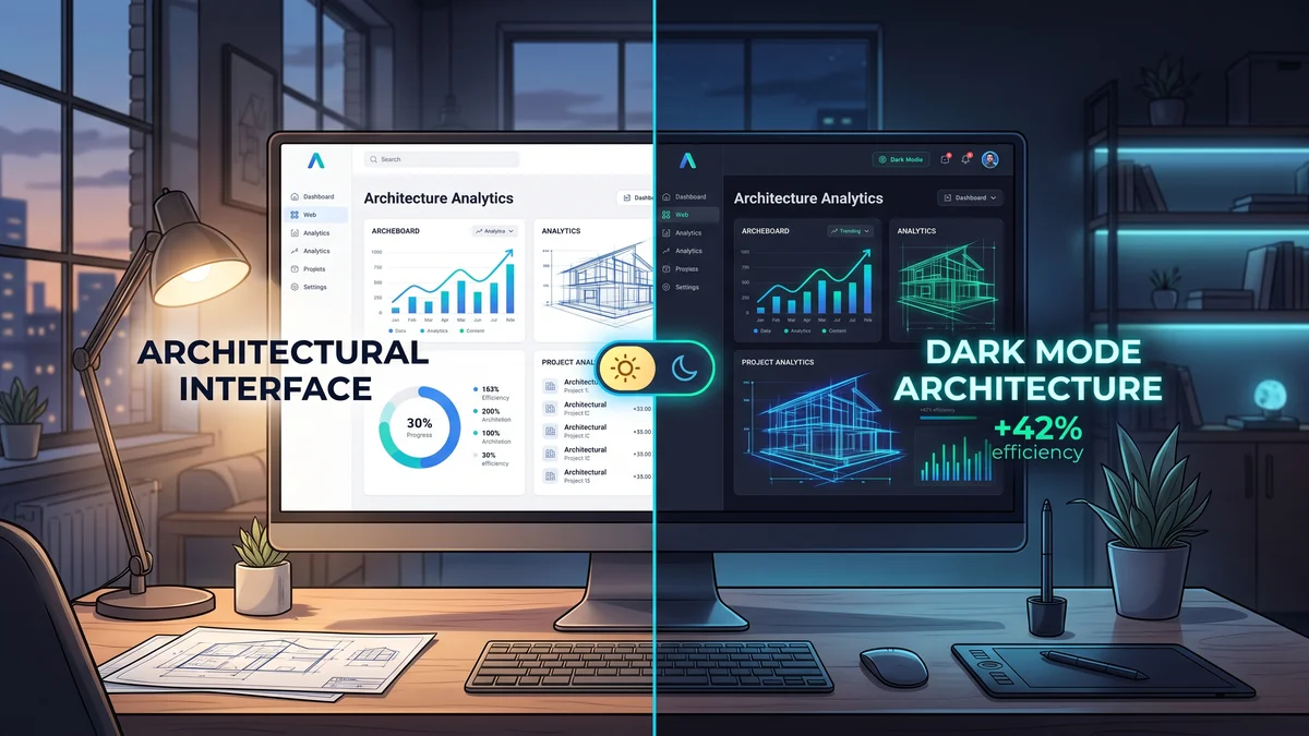
Dark mode is no longer an optional gimmick; it is an expected baseline feature across modern web and mobile applications. Users prefer dark interfaces in low-light environments to reduce eye strain, conserve OLED screen battery life, and personalize their digital workspace. However, hacking dark mode into an existing application with ad-hoc CSS overrides creates visual bugs, unreadable text contrast, and maintenance headaches.
Engineering a seamless theme switching system requires an architectural approach utilizing CSS Custom Properties, system preference synchronization, and local persistence.
Define semantic color tokens mapped to CSS Custom Properties rather than hardcoding static hex colors across stylesheets:
:root {
  --bg-primary: #FFFFFF;
  --text-primary: #0F172A;
  --border-color: #E2E8F0;
}

[data-theme="dark"] {
  --bg-primary: #0B0F19;
  --text-primary: #F8FAFC;
  --border-color: #1E293B;
}

body {
  background-color: var(--bg-primary);
  color: var(--text-primary);
  transition: background-color 0.2s ease, color 0.2s ease;
}Provide users with a tri-state theme selector: Light, Dark, and System.
@media (prefers-color-scheme: dark).localStorage.<head> that checks localStorage and immediately applies the data-theme="dark" attribute before CSS paints.At Sylnovia, our frontend developers architect sleek, accessible dark mode themes that respect system preferences and enhance user comfort. Upgrade your application's aesthetic by contacting our team.
Delivering deep technical insights, architectural blueprints, and digital strategy for modern engineering squads.





The Strategic Hiring Dilemma for Growing Businesses When leadership teams decide to build a custom software platform or...
The False Dichotomy of Manual vs. Automated QA In software engineering discussions, testing is often framed as an all-o...
Why Enterprise B2B Buyers Mandate SOC 2 Type II When selling software to Fortune 500 enterprises, healthcare organizati...